WEBSITE DESIGN + CREATIVE DIRECTION
Beyond borders
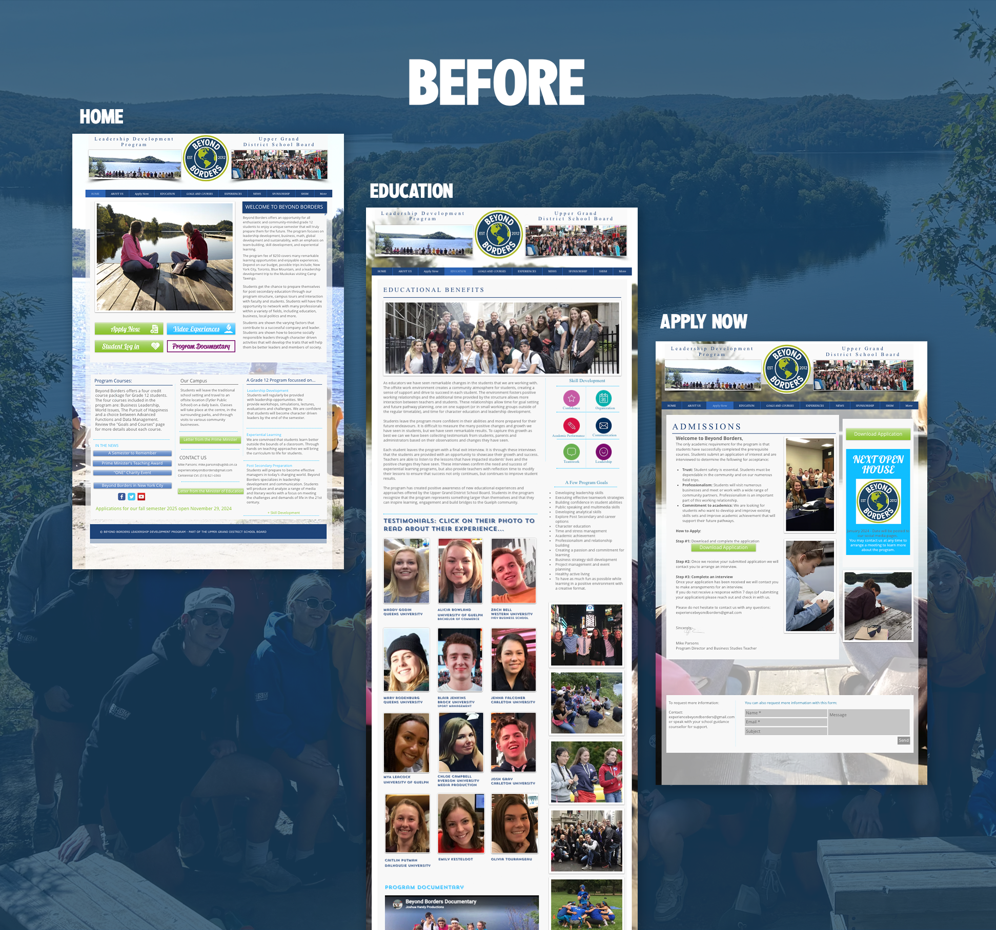
The old site was outdated and overdue for a refresh. Pages were packed with so much copy that it was hard to digest. Visitors had to search through dense blocks of text just to find what they were looking for. The layout felt cluttered and disorganized, making it tough to get a clear sense of what Beyond Borders actually offers. And on top of all that, the site wasn't optimized for mobile, which meant a frustrating experience for the majority of visitors browsing on their phones.
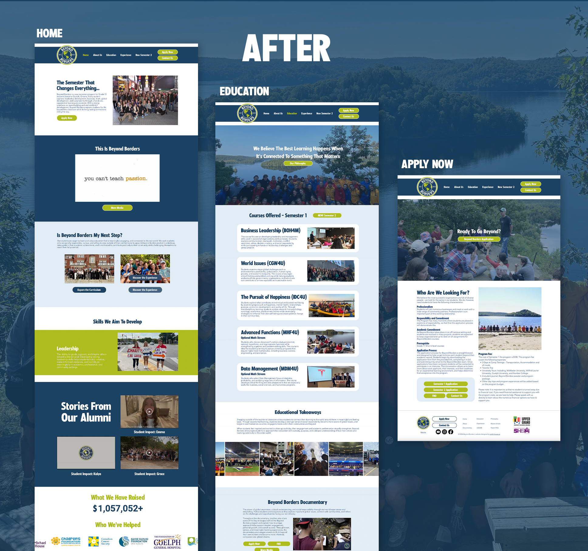
THE SOLUTION
The site has been completely refreshed and built to last. It's now easy to navigate and easy to understand, with the crucial information visitors are looking for front and center. No more digging through cluttered pages. Fully responsive and mobile-friendly, it gives Beyond Borders a clean, professional online presence that finally reflects the quality of their programs and makes it simple for prospective students and partners to find their way in.